
Orbit
UX RESEARCH | UX DESIGN | UI DESIGN | USABILITY TEST | KEY TAKEAWAYS
Overview
Access to quality education is one of the most empowering tools we can offer. As technology continues to bridge gaps, learning opportunities are becoming more flexible, accessible, and affordable. This project focuses on designing a smooth and trustworthy experience for parents looking to connect their children with the right language tutors.
Role
UX Researcher, UX/UI Designer
Toolkit
Figma, FigJam, Pencil & Paper
UX Research
Overview
Background
This app is an end-to-end platform that helps parents find the right language tutors for their children through a simple and supportive experience:
Browse verified tutor profiles
Book lessons directly through the app
Track progress and build long-term connections
Research Goals
From the beginning, my goal was to design an app that helps parents feel confident - not confused - when choosing a tutor, whether through smart filters, trusted reviews, or tailored recommendations.
Methodology
– 5 informal interviews with parents of school-aged children
– 20 online survey responses
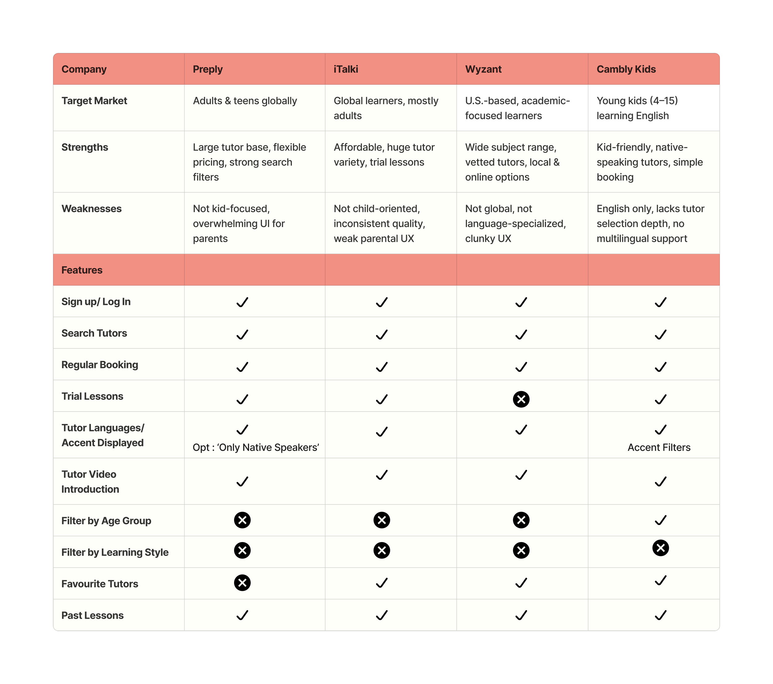
– Competitor analysis
– Affinity diagramming to identify pain patterns and emotional driversCompetitive Analysis
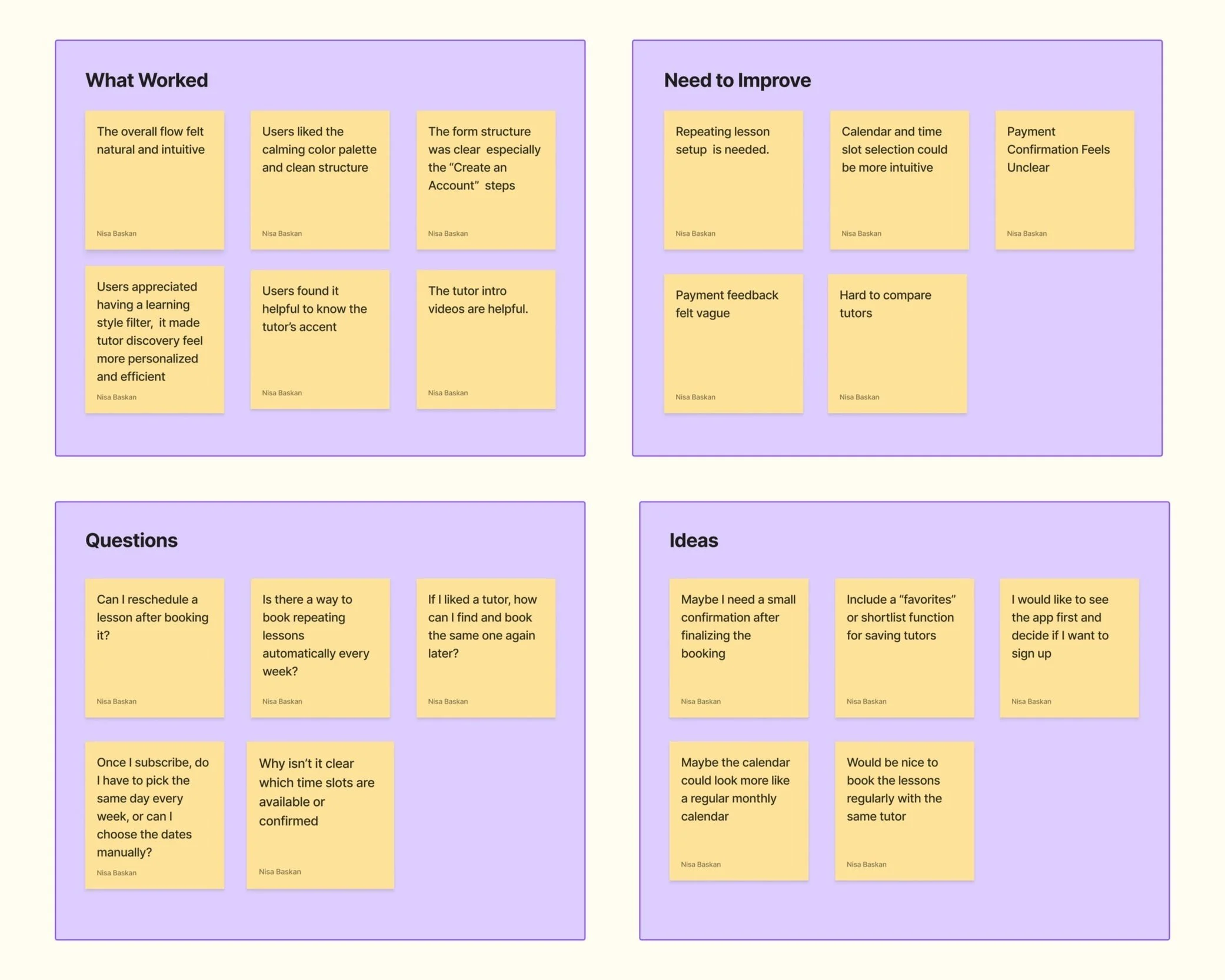
User Interviews
Five individuals were interviewed to inform the affinity mapping for the language tutor booking app. All participants were parents of children who had either previously booked language tutors or were actively exploring tutoring options. While most had school-aged children, the app is also designed to support parents of younger learners seeking early language education. Interviews were conducted remotely via Google Meet.
👩👧 3 Active or Interested Users
These parents had recently searched for or booked online tutors. They provided detailed insights into onboarding, tutor selection, scheduling, and maintaining their child's motivation.❓ 2 First-Time or Infrequent Users
These parents had limited exposure to tutoring apps. Their feedback centered around first impressions, hesitations about creating accounts, and concerns about app clarity.Affinity Mapping
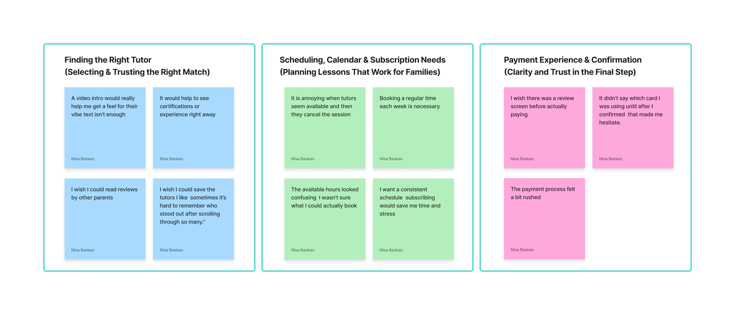
Research Findings
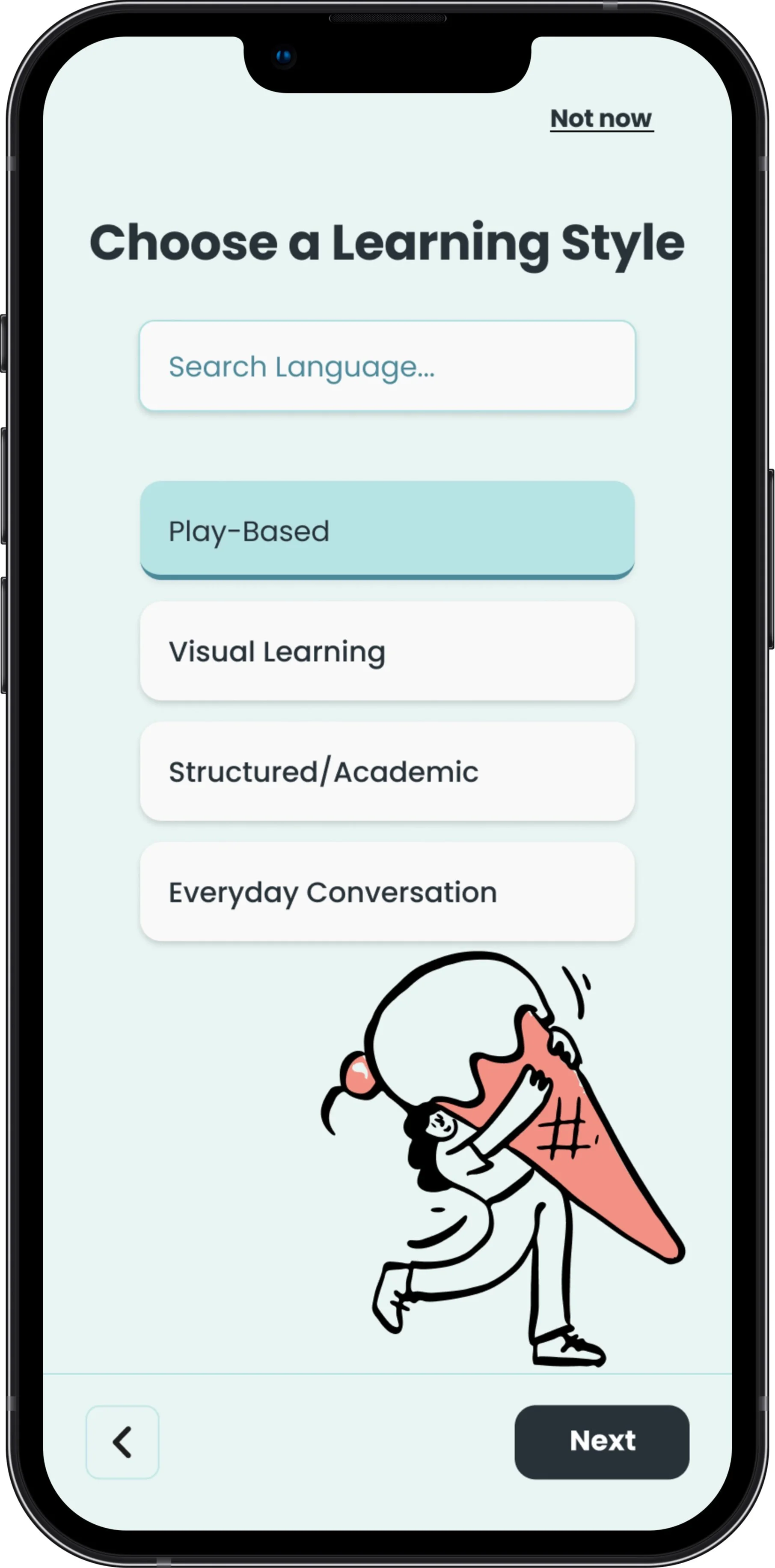
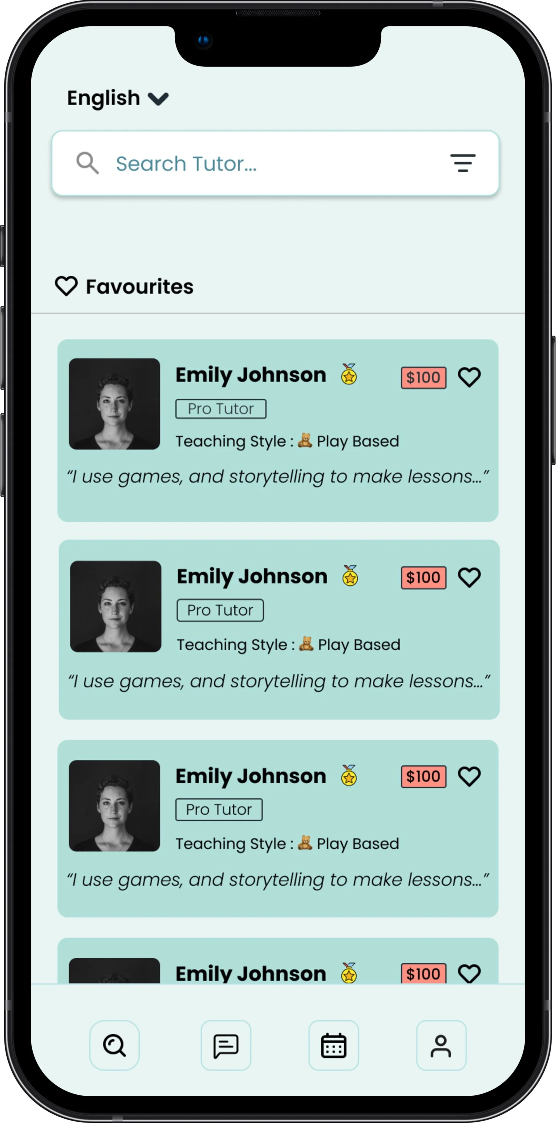
Parents want help choosing the right tutor, including clearer bios, teaching style tags, and video introductions to build trust and confidence in their decision.
Scheduling lessons feels unreliable and confusing, with issues like lack of recurring bookings, and missing calendar integrations.
Maintaining engagement over time is hard, especially without progress tracking, tutor feedback, or motivational features to keep kids consistent.
The onboarding process creates early friction, as requiring account creation before browsing discourages new users from exploring the app.
Parents need transparency and control, including verified tutors, privacy assurances, and features to manage how their children interact with the app.
Parents need clear confirmation after booking to feel reassured that everything went through correctly, it builds trust and avoids second-guessing.
Persona #1
👩 Soyoung Jung — The Practical Mom

“I don’t have time to scroll through endless profiles to find the right tutor for my kids.Language is personal for us, not just academic.I want my children to feel confident, not just in school, but also in everyday life. It’s important they adapt socially, make friends, and feel at home here in Mexico”
Age: 39
Ethnicity: Korean
Location: Mexico City
Occupation: Regional Marketing Manager for a global brand
Languages Spoken: Korean (native), English (fluent), Spanish (conversational)
Income Level: Upper-middle class
Devices: iPhone and MacBook
Tech Comfort Level: High – confident and efficient with modern apps
Hobbies: Pilates, Korean cooking on weekends, cultural workshops for her kids, and digital planning tools like Notion and Google Calendar
Goals
Help her children become fluent in Spanish to thrive socially and academically
Maintain Korean language and culture at home
Find trustworthy tutors who fit her children’s learning style and schedule
Avoid decision fatigue, she wants a quick and reliable way to book the right tutor
Frustrations
Too many tutor options make it hard to know who’s actually a good fit
No time to compare profiles or message multiple tutors
Hard to find tutors who understand multicultural or bilingual households
Worries about wasting money on lessons with the wrong tutor
Persona #2
👨👧 Luis — The Protective Dad

“I never really spoke English fluently.But I want my son to have that chance.These days, technology makes learning more affordable.I just don’t want something too complicated to use.”
Age: 36
Ethnicity: Mexican
Location: Oaxaca, Mexico
Occupation: Hotel Receptionist
Languages Spoken: Spanish (native), English (basic)
Income Level: Lower-middle class
Devices: Android phone only
Tech Comfort Level: Low to moderate – uses WhatsApp, Facebook, and YouTube comfortably, but prefers very simple interfaces
Hobbies: Playing soccer on weekends, helping his son with homework, watching fútbol highlights, and listening to regional music
Goals
Wants his 7-year-old son to learn English early for a better future
Hopes to find a friendly, patient tutor who connects well with kids
Needs an app that’s easy to use on his phone and doesn’t require a laptop
Prefers a platform where he can see the tutor first, not just read a profile
UX Design
Project Goals
Design a simple and trustworthy platform that helps parents quickly find the right language tutor for their child, while reducing decision fatigue through clear profiles, smart filters, and a seamless booking flow.
Information Architecture
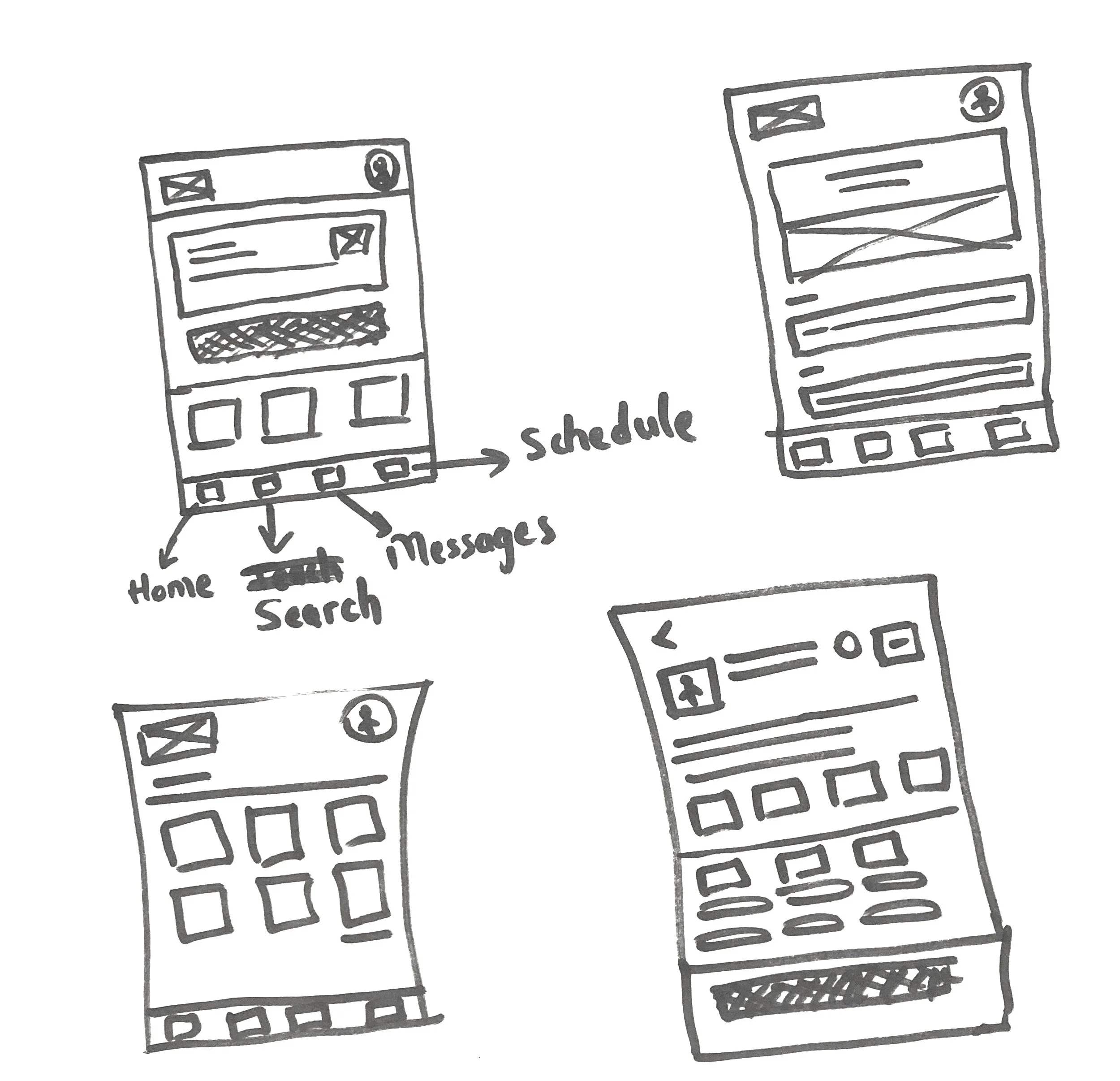
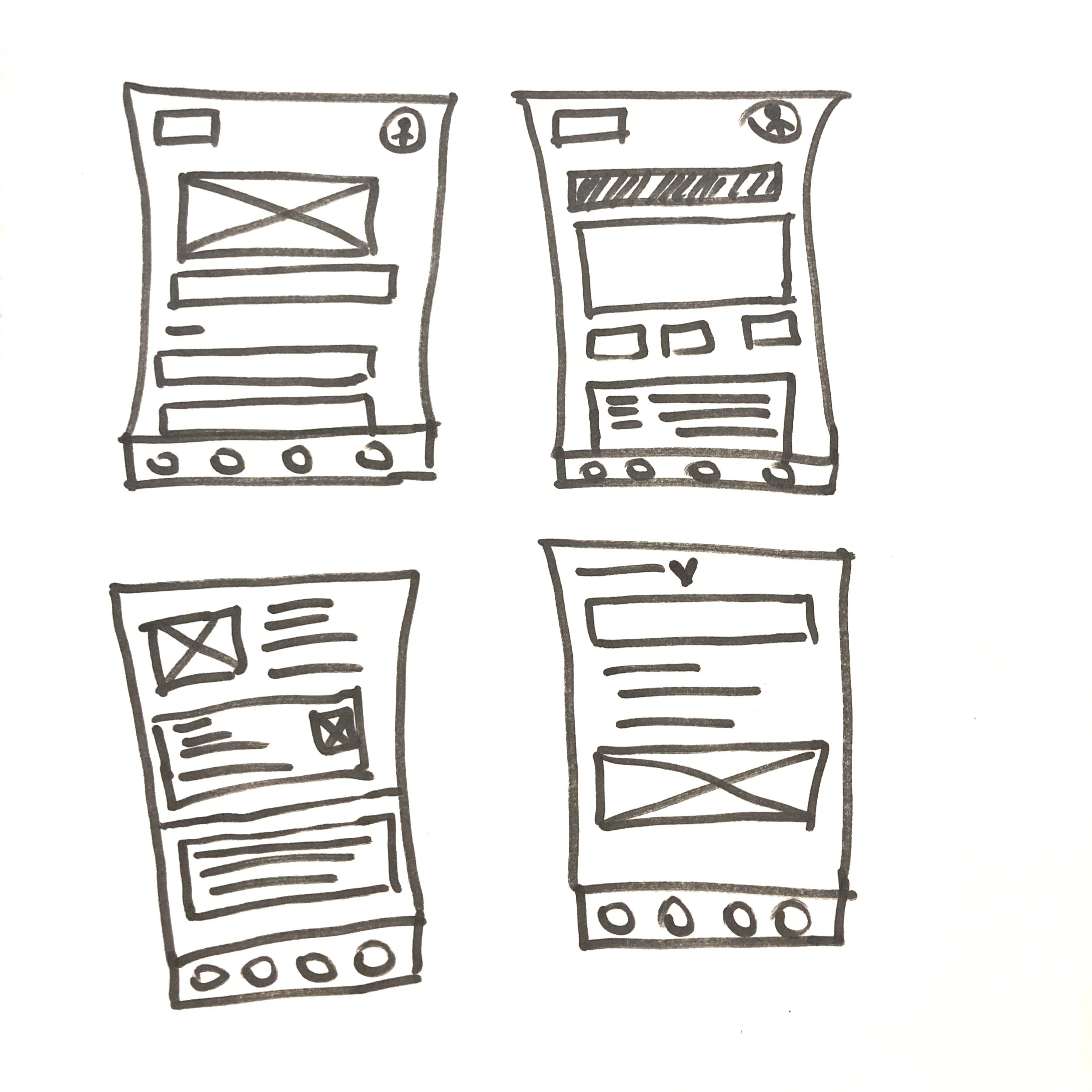
Wireframes
Frustrations
Feels nervous trusting someone he’s never met to teach his child
Struggles to know what makes a tutor “good” or worth the price
Worries his son might lose interest if the tutor doesn’t make it fun
Wants to help his son but doesn’t feel confident guiding him through something he never learned himself
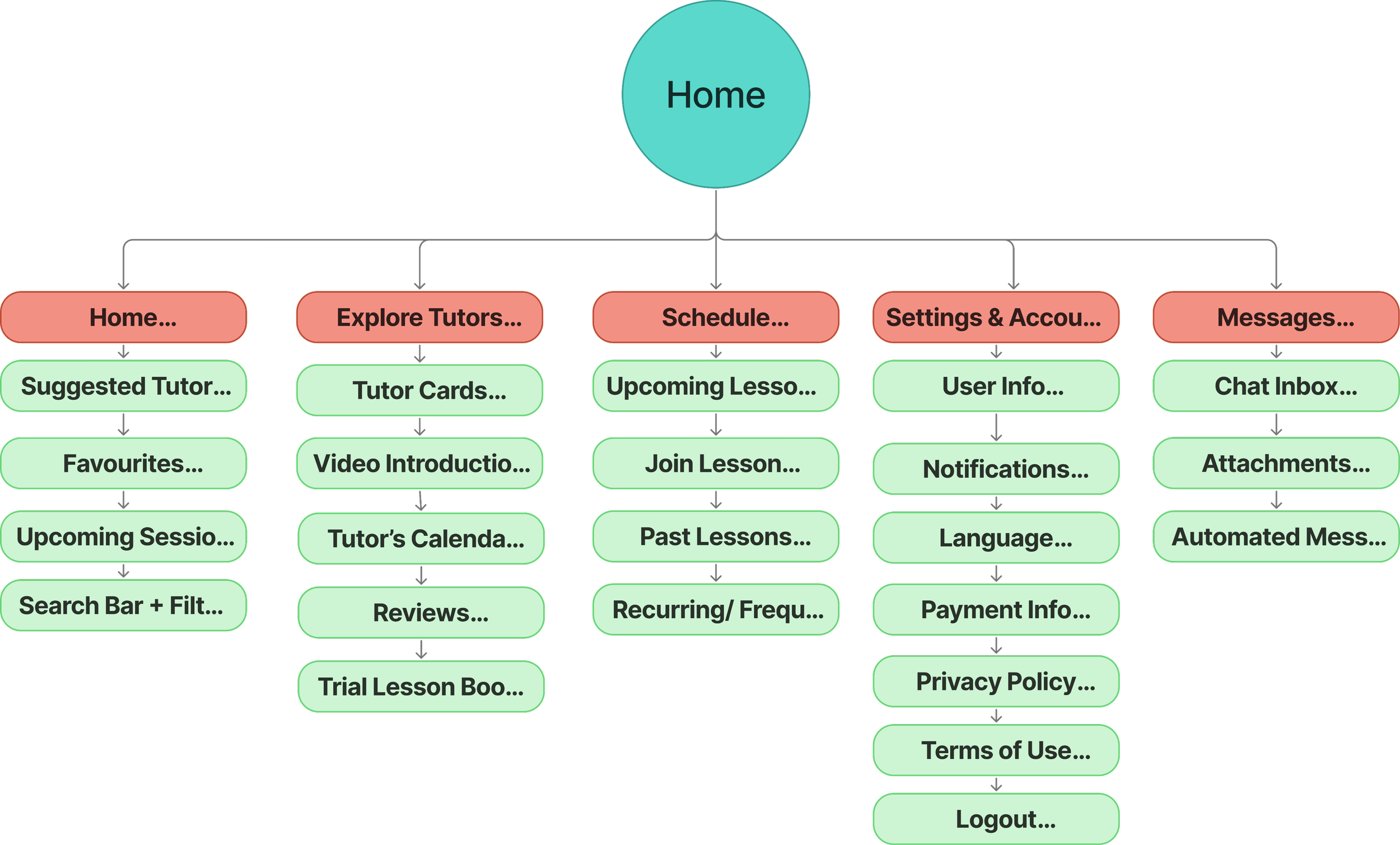
The sitemap is organized around key user actions: browsing tutors, managing lessons, messaging, and adjusting account settings to support a focused, task-driven experience.
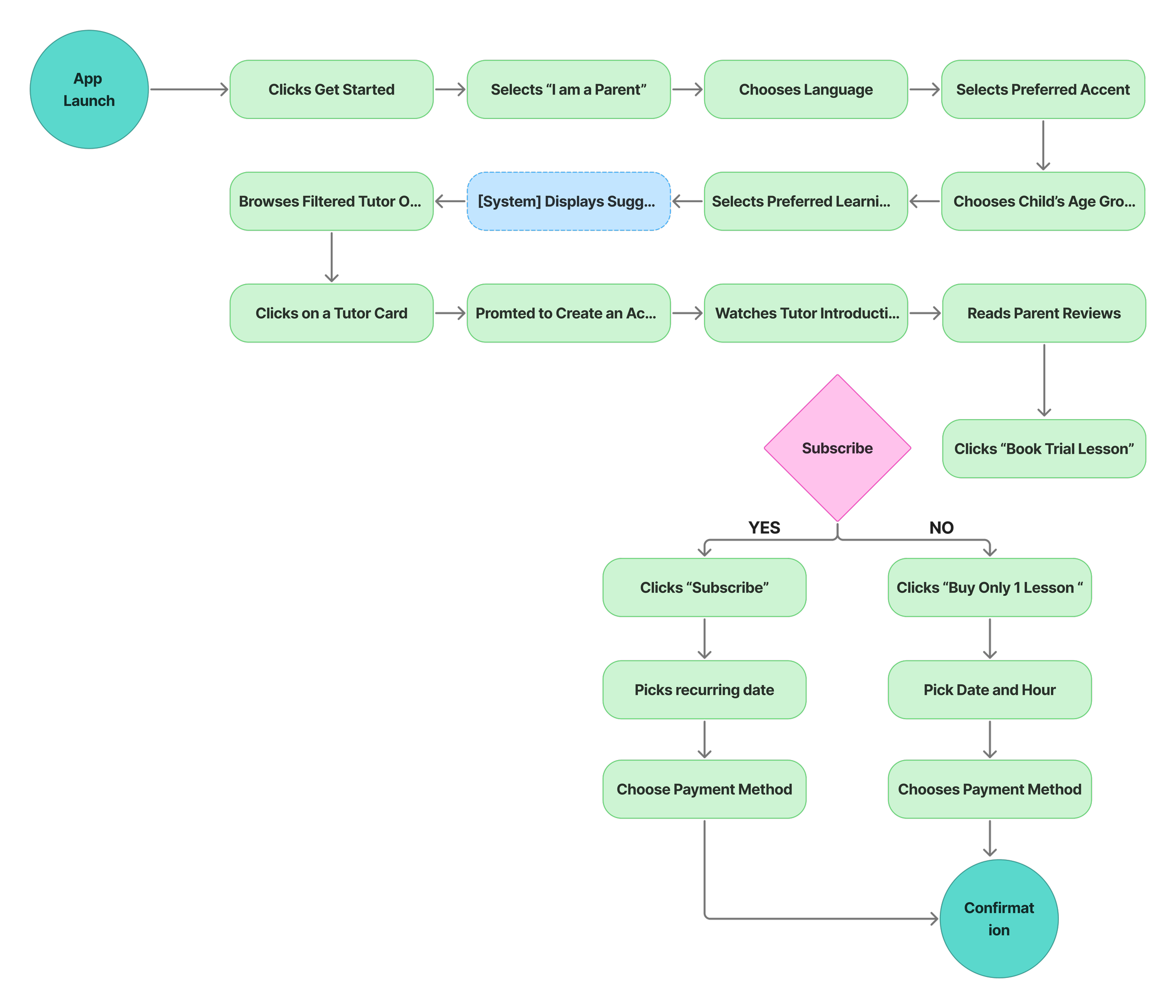
User Flow – Find and Book a Tutor as a New User
A parent visits Orbit to find and book a language tutor for their child. This flow is optimized for trust, speed, and simplicity.
UI Design
Brand Identity
First of all, I explored potential names and visual symbols that reflect the mission of connecting parents with trusted tutors. I chose the name Orbit to represent support, connection, and movement just like a planet held in steady motion by the pull of a trusted force.
The name symbolizes the safe environment parents seek for their children’s learning journey, always in motion, yet centered around care and growth. The brand’s tone is calm and trustworthy, designed to make parents feel that their child is in good hands. The logo evolved from the left option to the right options, as a horizontal layout felt more balanced and better suited for the app's interface.
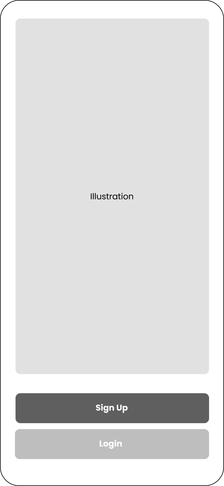
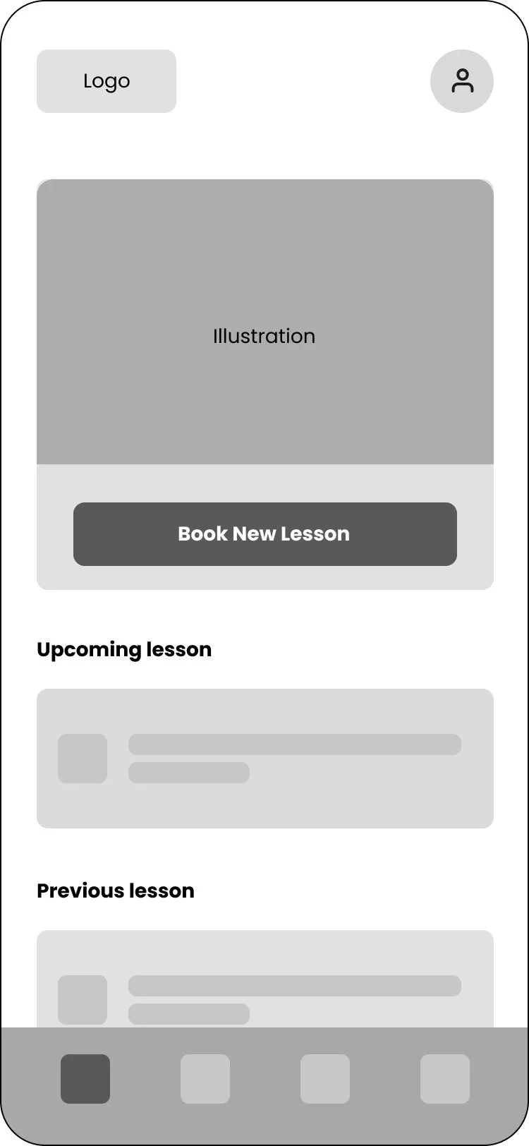
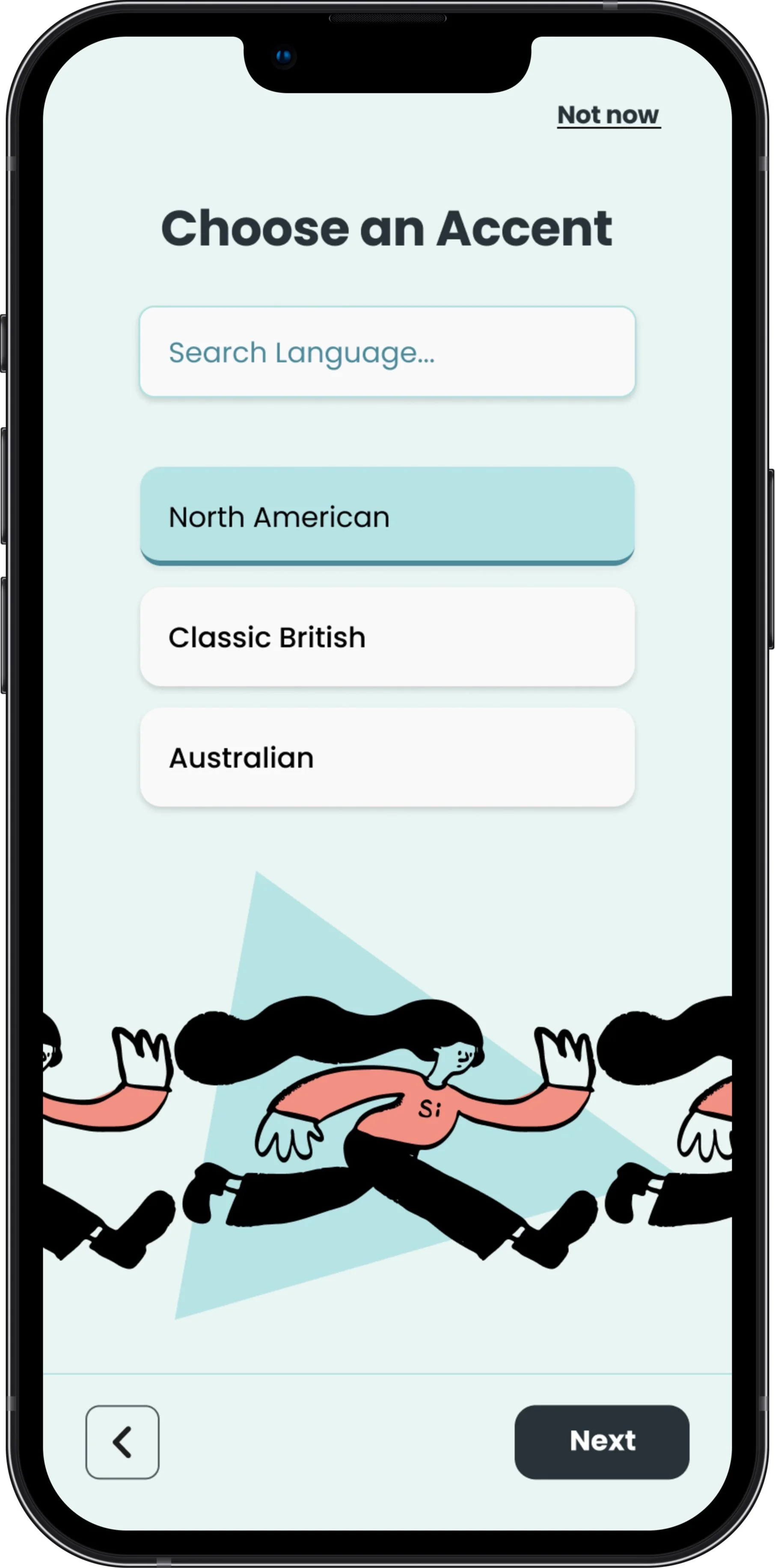
High Fidelity Screens

Usability Test
Prototype
I’ve mainly worked with components and variants throughout the entire project. For that reason, it was quite straightforward to build up the prototype.
To maintain a smooth and cohesive flow, I used consistent mild transitions between screens with shared elements, while opting for more dynamic, bouncy effects when moving between distinct stages like the intro and onboarding, signaling a shift and adding energy.
Outcome
The usability test gave me valuable insights into how parents interact with the app. Based on their feedback, I added features like learning style filters, clearer calendar visuals, and improved tutor booking confirmations to better support their needs.
Iterations
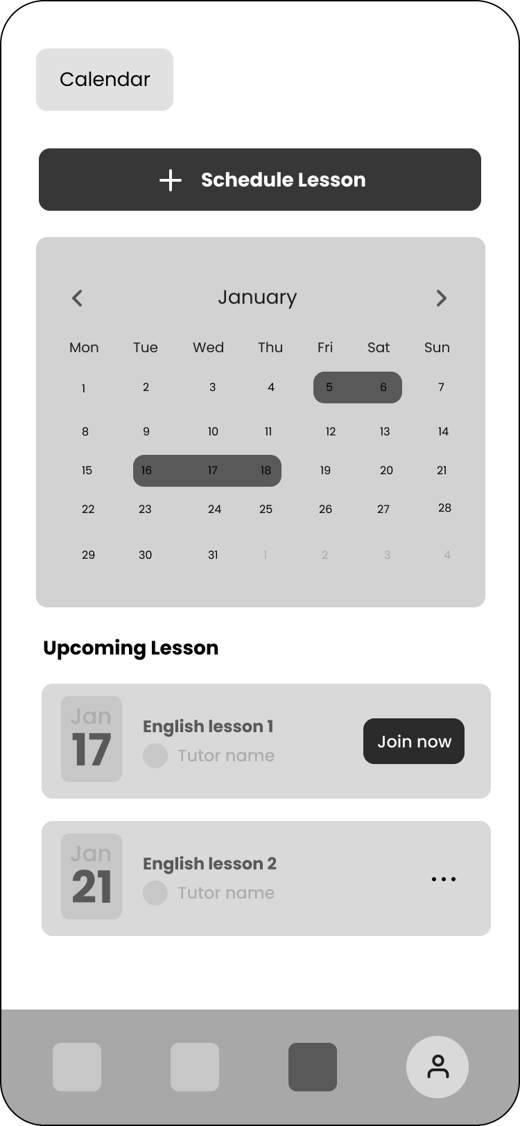
Improved Calendar Design
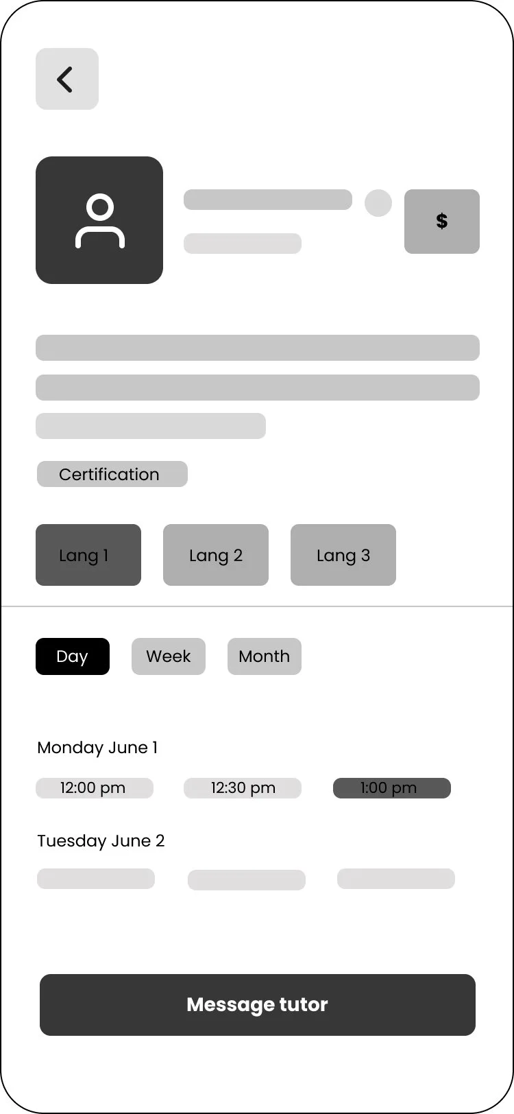
To improve the booking experience, I iterated on the calendar design. Initially, users struggled with selecting available time slots and understanding which dates were bookable/ not bookable. After testing, I redesigned the calendar to include clearer visual cues, such as highlighted availability, day-based navigation, and more intuitive time slot selection along with clearly marked unavailable dates. These updates made the booking process smoother and more parent-friendly.
Subscription Flexibility
To support parents seeking consistent progress for their children, I introduced a subscription option whichs allows them to easily commit to regular lessons. While the subscription flow doesn't yet include recurring date selection, this feature lays the foundation for a more reliable and structured learning experience.
Booking Confirmation Screen
After usability testing, it became clear that users needed stronger feedback once they completed a booking. I designed a dedicated confirmation screen that appears immediately after payment. It includes:
Tutor name and photo
Lesson date and time
Language selected
Payment summary with amount and method used
A '“Back to Home” and “Message Tutor” option if they have any questions about the lesson
A subtle success animation (like a checkmark) to reinforce that the action was completed

Key Takeaways
• Challenge
Balanced simplicity with functionality to create a clear, trustworthy experience for parents
Thinking through all the small details parents care about from compatibility to calendar flow and tutor credibility
• Lessons Learned
Simplicity makes a huge difference from early user flows to the final booking experience
A well-structured UI library using components and variants is essential for consistency and scalability
Designing with consistency and intention accelerates decision-making and keeps the experience intuitive — a reminder of how essential it is to follow each stage of the UX process while staying focused on user needs and intentions